- Introduction What is Layer Cake? Key Concepts Getting started Using layout components Layer components Data-less cakes Server-side rendering How does LayerCake know what to set as a scale's domain and range?
- Troubleshooting Use the debug feature TypeScript The chart is blank The chart is a very small square The library isn't building properly Listening for click events on the entire component
- Accessibility Layout attributes HTML layouts SVG layouts Canvas and WebGL layouts
- LayerCake props dataxyzrdebugpaddingxScaleyScalezScalerScalexDomainyDomainzDomainrDomainxDomainSortyDomainSortzDomainSortrDomainSortxPaddingyPaddingzPaddingrPaddingxNiceyNicezNicerNicexRangeyRangezRangerRangexReverseyReversezReverserReverseflatDatassrpercentRangepositioncustompointerEventsverbosewidthheight
- Computed context values activeGettersaspectRatioconfigcontainerWidthcontainerHeightdatawidthheightxyzrxDomainyDomainzDomainrDomainxRangeyRangezRangerRangexGet(...)yGet(...)zGet(...)rGet(...)xScaleyScalezScalerScale
- Layout components Html Svg ScaledSvg Canvas WebGL
- Layout component props zIndexpointerEventsoverflowviewBoxfixedAspectRatiocontextAttributes
- Helper functions bin(...)calcExtents(...)flatten(...)groupLonger(...)raise(...)scaleCanvas(...)stack(...)takeEvery(...)uniques(...)
Table of contents
Introduction edit this section
What is Layer Cake?
Layer Cake is a headless graphics framework for Svelte that removes the boilerplate from making responsive web graphics. It gives you common elements, like a coordinate system and scales, for you to start creating your own dataviz layers, like axes, plots and annotations.
Layer Cake is described as a "headless" framework and not a library because unlike Vega or Highcharts, it doesn't automatically create, for example, a scatter chart for you. Instead, it gives you the scales and the DOM element to encode chart elements from your data and lets you decide what shapes and visuals to build with those pieces.
The reason for this design is that most charts end up needing some customization in one way or another. Other libraries handle customization usually by creating a complex JSON specification but learning that is a big investment and can be another layer of abstraction to take into account.
The idea behind a Layer Cake chart is you can start from a basic scatter, line or bar chart template and – because those chart layers live in your project – you can customize them however you want.
By organizing a graphic into layers, you can more easily reuse components from project to project. It also lets you easily move between web languages (SVG, Canvas, HTML, WebGL) by giving you a common coordinate system they can all use. That way, you can choose the best format for each element without worrying about superimposing different elements on top of one another.
Layer Cake is more about having a system to organize your own custom components than it is a high-level charting library.
Layer Cake uses D3 scales. See more in the xScale, yScale, zScale and rScale sections of the Layer Cake Props API.
Key Concepts
- Layer components exist inside your own project. Layer Cake doesn't have any built-in concept of what a bar chart or column chart is, for example. It is a tool to give you scales and empty containers to draw on.
- Layer Cake needs a flat array of objects to measure the extents of your data. In most cases, what you pass in to the
dataprop is already a flat array of objects. In some cases, though, like multi-series line charts or maps, your data needs to take on a more complex shape. In these instances, pass in a flat array of objects to theflatDataprop and your accessors will be called on each object in order to calculate your scale extents. - For most scale types, such as linear scales, Layer Cake measures the extents of your data as the
[min, max]. For categorical scale types (scaleBand,scalePointandscaleOrdinal), it calculates the extent as the unique values in that list. Also, if your y-scale is not one of these categorical scales, it reverses the default range from[0, height]to[height, 0]in order to match the DOM coordinate system and make drawing easier out of the box.
Getting started
Install Layer Cake in your dependencies alongside Svelte.
npm install --save layercakeThe easiest way to get started is to clone down, or use degit to grab the starter template at https://github.com/mhkeller/layercake-template.
degit mhkeller/layercake-template my-chart
cd my-chart
The App.svelte file in this example is your main Svelte component. You can render a <LayerCake> inside a DOM element like so.
<script>
  import { LayerCake } from 'layercake';

  // Define some data
  const points = [
    { x: 0, y: 0 },
    { x: 5, y: 10 },
    { x: 10, y: 20 },
    { x: 15, y: 30 },
    { x: 20, y: 40 }
  ];
</script>

<div class="chart-container">
  <LayerCake data={points} x="x" y="y">
    <!-- Components go here -->
  </LayerCake>
</div>

<style>
  /*
    The wrapper div needs to have an explicit width and height in CSS.
    It can also be a flexbox child or CSS grid element.
    The point being it needs dimensions since the <LayerCake> element will
    expand to fill it.
  */
  .chart-container {
    width: 100%;
    height: 300px;
  }
</style>
Each of the chart examples can be downloaded or edited live in the browser by clicking on the "Download" or "Edit" buttons, respectively.
Using layout components
Within the LayerCake component, you'll want to add at least one layout component, kind of like a wrapper. It can be Svg, Html, Canvas or WebGL. Within any of these is where you'll put your own custom layer components. Here's an example with a few different layout elements working together.
<script>
  import { LayerCake, Svg, Canvas, Html } from 'layercake';

  // These are components that live in your project that
  // you can customize as you see fit
  import ScatterCanvas from './components/ScatterCanvas.svelte';
  import AxisX from './components/AxisX.svelte';
  import AxisY from './components/AxisY.svelte';
  import Annotations from './components/Annotations.svelte';

  // Set up some data
  const points = [
    { x: 0, y: 0 },
    { x: 5, y: 10 },
    { x: 10, y: 20 },
    { x: 15, y: 30 },
    { x: 20, y: 40 }
  ];

  const annotationBlurbs = [{ x: 10, y: 20, text: 'Look at this value!' }];
</script>

<div class="chart-container">
  <LayerCake x="x" y="y" data={points}>
    <Canvas>
      <ScatterCanvas fill={'blue'} r={3} />
    </Canvas>

    <Svg>
      <AxisX />
      <AxisY />
    </Svg>

    <Html>
      <Annotations blurbs={annotationBlurbs} />
    </Html>

    <!-- If you wanted to, you could add another <Svg> again... -->
  </LayerCake>
</div>

<style>
  /*
    The wrapper div needs to have an explicit width and height in CSS.
    It can also be a flexbox child or CSS grid element.
    The point being it needs dimensions since the <LayerCake> element will
    expand to fill it.
  */
  .chart-container {
    width: 100%;
    height: 300px;
  }
</style>
Layout components have a few of their own properties that let you customize behavior. Read more in the Layout Components section.
Layer components
The only components the Layer Cake module exports are LayerCake and those layout components, everything else that actually draws your chart is up to you to create. Inside those layer components you can access the scales and other values derived from your data. You do this with Svelte's getContext function.
Here's an example starting with a similar App.svelte file to the example above. We're creating a scatter chart in SVG.
<script>
  import { LayerCake, Svg } from 'layercake';
  import Scatter from './components/Scatter.svelte';

  const points = [
    { x: 0, y: 0 },
    { x: 5, y: 10 },
    { x: 10, y: 20 },
    { x: 15, y: 30 },
    { x: 20, y: 40 }
  ];
</script>

<div class="chart-container">
  <LayerCake x="x" y="y" data={points}>
    <Svg>
      <!-- You can expose properties on your chart components to make them more reusable -->
      <Scatter fill={'blue'} r={3} />
    </Svg>
  </LayerCake>
</div>

<style>
  /*
    The wrapper div needs to have an explicit width and height in CSS.
    It can also be a flexbox child or CSS grid element.
    The point being it needs dimensions since the <LayerCake> element will
    expand to fill it.
  */
  .chart-container {
    width: 100%;
    height: 300px;
  }
</style>
This is what the scatter component looks like:
<script>
  // Import the getContext function from svelte
  import { getContext } from 'svelte';

  // Access the context using the 'LayerCake' keyword
  // Grab some helpful functions
  const { data, x, xScale, y, yScale } = getContext('LayerCake');

  let { fill = '#000', r = 5 } = $props();
</script>

<g>
  {#each $data as d}
    <circle cx={$xScale($x(d))} cy={$yScale($y(d))} {fill} {r} />
  {/each}
</g>
You could hardcode the radius and fill in the component but exposing those variables to your App makes this component more reusable from project to project. Or, within a project, you could use the same layer component to render different charts of varying color.
A few notes on this component:
- Everything that you destructure from
getContext('LayerCake')is a Svelte store so prefix them with$in the template. - This example is a bit verbose because we're calling our accessor functions and then our scale functions. You can combine these two steps with the built-in
xGetandyGetfunctions. Like so:
<script>
  // Import the getContext function from svelte
  import { getContext } from 'svelte';

  // Access the context using the 'LayerCake' keyword
  // Grab some helpful functions
  const { data, xGet, yGet } = getContext('LayerCake');

  // Customizable defaults
  let { fill = '#000', r = 5 } = $props();
</script>

<g>
  {#each $data as d}
    <circle cx={$xGet(d)} cy={$yGet(d)} {fill} {r} />
  {/each}
</g>
Many common chart types have example pages. See the gallery at https://layercake.graphics or use the dropdown menu at the top of the page to navigate to one.
Data-less cakes
You can also use Layer Cake to simply arrange SVG, HTML, Canvas and WebGL elements on top of one another, sharing the same dimensions. For example, this would be handy if you have some SVG artwork that you want to put on top of an HTML video player.
Here's an example that doesn't set any properties on the LayerCake component:
<script>
  import { LayerCake, Svg, Html } from 'layercake';
  import Frame from './components/Frame.svelte';
  import VideoPlayer from './components/VideoPlayer.svelte';
</script>

<div class="chart-container">
  <LayerCake>
    <Svg>
      <Frame />
    </Svg>

    <Html>
      <VideoPlayer />
    </Html>
  </LayerCake>
</div>

<style>
  /*
    The wrapper div needs to have an explicit width and height in CSS.
    It can also be a flexbox child or CSS grid element.
    The point being it needs dimensions since the <LayerCake> element will
    expand to fill it.
  */
  .chart-container {
    width: 100%;
    height: 300px;
  }
</style>
Server-side rendering
See the layercake-template for the rollup config needed to compile LayerCake server-side. In short, it creates a JavaScript file, which then constructs the required HTML and CSS when executed. You have the option of also hydrating that markup with any additional client-side JavaScript, or building it without any bundled JavaScript.
You can also use LayerCake in Svelte Kit to create charts that work without JavaScript, which is how the server-side examples on this site work. Just set the ssr prop to true. Check out the examples on the home page for useful patterns using the percentRange option, the ScaledSvg component and other percentage-based components.
How does LayerCake know what to set as a scale's domain and range?
As of version 7.0, Layer Cake tries to be a little smarter about how it calculates these values. For categorical scales (like scaleBand, scalePoint and scaleOrdinal), it calculates the extent as the list of unique values in your data for a given field. This is useful for bar charts, column charts or color scales where you have discrete values as opposed to a continuous range.
For all other scale types, Layer Cake measures the extent as the simple [min, max] values.
The default ranges for each dimension are:
- x:
[0, width] - y:
[height, 0], unless using ascaleBandorscalePointand it is[0, height] - r:
[1, 25]. The min is1and not zero because this is ascaleSqrtby default and0is not allowed in that type of chart. - z:
[0, width]
Troubleshooting edit this section
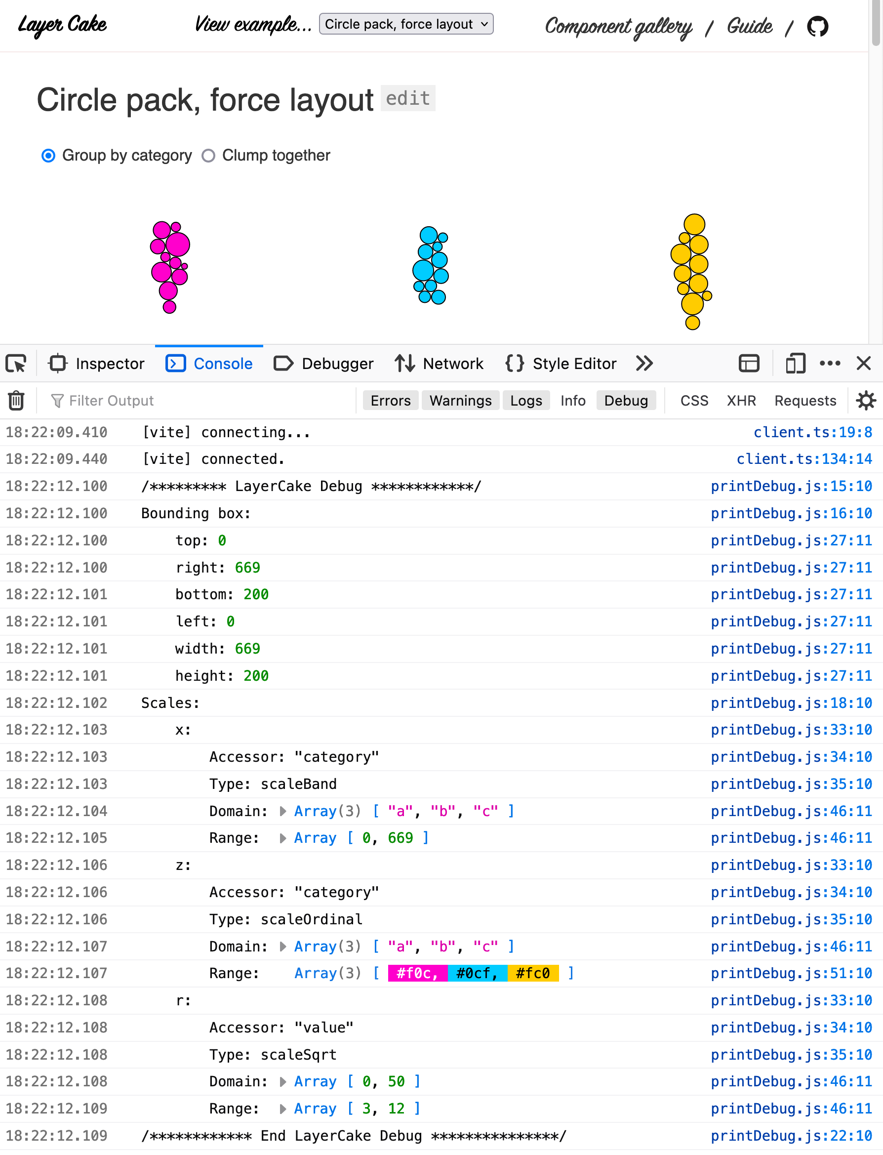
Use the debug feature
To get more information about what scales you're using and the calculated domain and range, set the debug prop to true.
<LayerCake
  debug={true}

  <!-- Can also be set simply with this Svelte shorthand -->
  debug
>
This will print:
- The bounding box dimensions of your chart container
- The scales you have currently set and for each one:
- The accessor function or string key
- The scale type
- The
domain - The
range
It's helpful if you're trying to track down why a chart is not displaying correctly, which comes down to CSS not being set on the parent chart container or weird data issues (undefined, NaN values etc...) that are throwing off the extent calculation for the domain.
TypeScript
If you're using TypeScript, set the moduleResolution option in your tsconfig.json to bundler, per the SvelteKit docs.
The chart is blank
The <LayerCake> component expands to fill the size of its parent <div> – that's why all of the examples define a chart-container element with a specific width and height. If your chart isn't showing up, make sure you have a width and height set on your wrapper div.
Inspect the DOM tree with your browser's dev tools and look at what width and height the Layer Cake layout elements are receiving and trace up the parents in the tree to see which element may not be sized properly. If you have an unusual combination of absolute-ly positioned elements, it could be one of the parents is not getting a specific width and height.
Also take a look in the console for any warnings. LayerCake will warn you if any of the dimensions are zero or negative.
The chart is a very small square
This is likely due to some other JavaScript error on the page. A small rectangle of a chart, probably 100x100 means that the server-side rendering was able to bake elements onto the page, but something short-circuited the JavaScript. Check for other console errors that halted the JavaScript process.
The library isn't building properly
Layer Cake is almost entirely a basic Svelte component. The exception is the index.js file, which is an esm module. This file, though, is non-essential to how the library works and is just a pointer for the rest of the library's imports. If you copy Layer Cake's source into your project directly and import the individual components, it should build just like any other Svelte component in your project.
For example:
<script>
  import LayerCake from './layercake/src/lib/LayerCake.svelte';
  import Svg from './layercake/src/lib/layouts/Svg.svelte';
  // etc...
</script>
Copying Layer Cake's layout components into your library is actually a great way to add any additional customizations or functionality while maintaining compatibility with the rest of the library's API. You can use any of the built-in layout components as a starting point for something more complex, if need be.
Listening for click events on the entire component
See the example in this issue.
Accessibility edit this section
Layout attributes
Since Layer Cake components live inside your project, you have full control over what your markup looks like. The exception is the built-in layout components Svg, ScaledSvg, Canvas, Html and WebGL.
Each of these components exposes props that will help with accessibility. These are the props that are common to all layout components:
label→ Setsaria-labellabelledBy→ Setsaria-labelledbydescribedBy→ Setsaria-describedby
<LayerCake>
  <Svg label="A chart label of some kind.">
    <!-- Components go here -->
  </Svg>
</LayerCake>
HTML layouts
These aria labels are not very meaningful for Html components without also specifying a role attribute so if you set any of the above attributes, your HTML component will have role='figure' set. If you don't want that value to be 'figure', the Html component – and only that one – has a role prop that will override it.
<LayerCake>
  <!-- By default, any Html component has role set to 'figure' but you can change it with a prop -->
  <Html role="figure" label="A chart label of some kind.">
    <!-- Components go here -->
  </Html>
</LayerCake>
SVG layouts
The Svg and ScaledSvg components have a titleText prop and a named title snippet.
The prop is shorthand to set the contents of a <title> tag like this:
<LayerCake>
  <Svg titleText="A chart title of some kind.">
    <!-- Components go here -->
  </Svg>
</LayerCake>
And becomes...
<div class="layercake-container">
  <svg class="layercake-layout-svg">
    <title>A chart title of some kind.</title>
    <!-- Components go here -->
  </svg>
</div>
If you want to compute the title's contents dynamically, you can use the named title snippet. Whatever the snippet renders is placed inside the <title> tag.
<LayerCake>
  <Svg>
    {#snippet title()}A chart title of some kind from a snippet.{/snippet}

    <!-- Components go here -->
  </Svg>
</LayerCake>
And becomes...
<div class="layercake-container">
  <svg class="layercake-layout-svg">
    <title>A chart title of some kind from a snippet.</title>
    <!-- Components go here -->
  </svg>
</div>
You mostly will just use the titleText prop but the snippet is there as an escape hatch. Setting the title snippet will override any value you set as the prop.
Canvas and WebGL layouts
The Canvas and WebGL layout components have a fallback prop that defines the text to display when <canvas> is unavailable.
<LayerCake>
  <Canvas fallback="A description of the chart to display when canvas is unavailable.">
    <!-- Components go here -->
  </Canvas>
</LayerCake>
And becomes...
<div class="layercake-container">
  <div class="layercake-layout-canvas">
    <canvas>A description of the chart to display when canvas is unavailable.</canvas>
  </div>
</div>
LayerCake props edit this section
These are the props you can set on the LayerCake component itself. You set them all like so:
<LayerCake
  foo='foo'
  bar='bar'
>
The component also exports an element prop that represents the main wrapper, in case you need to access it for some reason. It also exposes this as a slot prop.
<script>
  let mainElement;
</script>

<LayerCake bind:element={mainElement} let:element>
  {console.log(mainElement === element)}
</LayerCake>
data Array>|Object
A list of data items. If this is not a flat data array of objects, you'll also need to set flatData.
<LayerCake
  data={ myData }
>
x string|Function|number|Array|undefined
The key in each row of data that corresponds to the x-field. This can be a string, number (usually relating to an index of an array), an accessor function, or any combination of those types. This property gets converted to a function when you access it through the context.
<LayerCake
  x='myX'
  <!-- is equivalent to... -->
  x={ d => d.myX }
>
You can also give this value an array of strings or arrays of functions. While it may seem counter-intuitive to have more than one x- or y-accessor, this is the case in stacked layouts and Cleveland dot plots. See the Stacked bar, Stacked area, Stacked column or Cleveland dot plot for complete examples.
Here's an overview using the d3.stack() to make a horizontal bar chart, which will have two values for the x-accessor.
const data = [
  { month: new Date(2015, 3, 1), apples: 3840, bananas: 1920, cherries: 960, dates: 400 },
  { month: new Date(2015, 2, 1), apples: 1600, bananas: 1440, cherries: 960, dates: 400 },
  { month: new Date(2015, 1, 1), apples: 640, bananas: 960, cherries: 640, dates: 400 },
  { month: new Date(2015, 0, 1), apples: 320, bananas: 480, cherries: 640, dates: 400 }
];

const stack = d3.stack().keys(['apples', 'bananas', 'cherries', 'dates']);

const series = stack(data);
The data is now an array of values. The month values you can't see because d3.stack() sneakily stashes them as a property on the array, accessible as d.data.
[
  // apples
  [
    [0, 3840],
    [0, 1600],
    [0, 640],
    [0, 320]
  ],
  // bananas
  [
    [3840, 5760],
    [1600, 3040],
    [640, 1600],
    [320, 800]
  ],
  // cherries
  [
    [5760, 6720],
    [3040, 4000],
    [1600, 2240],
    [800, 1440]
  ],
  // dates
  [
    [6720, 7120],
    [4000, 4400],
    [2240, 2640],
    [1440, 1840]
  ]
];
The x- and y-accessors would then look like this:
<LayerCake
  x={ [0, 1] }
  y={ d => d.data.month }
>
Calls to x(dataRow) in this scenario will return the two-value array. Calls to xGet(dataRow) will return a two-value array, mapped through the xScale.
y string|Function|number|Array|undefined
Same as x but for the y dimension.
z string|Function|number|Array|undefined
Same as x but for the z dimension.
r string|Function|number|Array|undefined
Same as x but for the r dimension.
debug boolean
If this is true, Layer Cake will print to the console a helpful debug message.
<LayerCake
  debug={true}

  <!-- Can also be set simply with this Svelte shorthand -->
  debug
>
It will display:
- The bounding box dimensions of your chart container
- The scales you have currently set and for each one:
- The accessor function or string key
- The scale type
- The
domain - The
range
It's helpful if you're trying to track down why a chart is not displaying correctly, which comes down to CSS not being set on the parent chart container or weird data issues (undefined, NaN values etc...) that are throwing off the extent calculation for the domain.
If your domain or range includes values that are colors, the debug interface will highlight them in that color.
padding Object
An object that can specify top, right, bottom, or left padding in pixels. Any unspecified values are filled in as 0. Padding operates like CSS box-sizing: border-box; where values are subtracted from the parent container's width and height, the same as a D3 margin convention. (It's not called "margin" here because the behavior is more like CSS padding which goes from the outer edge inward, whereas margin goes from the outer edge outward.)
<LayerCake
  padding={ { top: 20, right: 10, bottom: 0, left: 0 } }
  // equivalent to...
  padding={ { top: 20, right: 10 } }
>
xScale d3.scaleLinear()
The D3 scale that should be used for the x-dimension. Pass in an instantiated D3 scale if you want to override the default d3.scaleLinear() or you want to add extra options.
See the Column chart for an example of passing in a d3.scaleBand() to override the default.
yScale d3.scaleLinear()
Same as xScale but for the y scale. The default is d3.scaleLinear().
zScale d3.scaleLinear()
Same as xScale but for the z scale. The default is d3.scaleLinear().
rScale d3.scaleSqrt()
Same as xScale but for the r scale. The default is d3.scaleSqrt().
xDomain Array:[min: number|null, max: number|null]|Array|Function
Set a min or max on the x scale. If you want to inherit the value from the data's extent, set that value to null. If you set an array with no nulls, the dynamic extent calculation of the data for that dimension will be skipped. This can be useful as a performance improvement.
<LayerCake
  xDomain={ [0, 100] } // Fixes the x scale's domain
  // or..
  xDomain={ [0, null] } // Fixes the min but allows the max to be whatever is in the data
>
This value can also be a longer array because sometimes your scales are piecewise or are a list of discrete string values such as in ordinal scales, useful for color series.
<LayerCake
  xDomain={ [-1, 0, 1] } // Could be useful to create a diverging scale
  // or..
  xDomain={ ['group-1', 'group-2', 'group-3'] } // Could be useful for a column chart
>
If you set a scaleBand, scalePoint or scaleOrdinal to any of the scales, the automatically calculated domain will be a list of unique values for the associated accessor instead of a two-value [min, max] array. This is useful for color scales or groups. If you want to sort this group, you can pass a function to this prop and it will receive the calculated list of unique values as an argument.
<LayerCake
  // Domain for a column chart was calculated as: ['1989', '1992', '1991', '1990']
  // and we want to sort it properly
  xDomain={ domain => domain.sort() }
>
yDomain Array:[min: number|null, max: number|null]|Array|Function
Same as xDomain but for the y scale.
zDomain Array:[min: number|null, max: number|null]|Array|Function
Same as xDomain but for the z scale.
rDomain Array:[min: number|null, max: number|null]|Array|Function
Same as xDomain but for the r scale.
xDomainSort boolean=false
Taken into account only when the x-scale is ordinal. If true, sets whether the calculated unique items come back sorted. It uses d3.ascending to do the sort calculation.
Set this to false if you want the unique items to appear in the order they were found in the data, which is the default.
yDomainSort boolean=false
Same as xDomainSort but for the y domain.
zDomainSort boolean=false
Same as xDomainSort but for the z domain.
rDomainSort boolean=false
Same as xDomainSort but for the r domain.
xPadding Array:[leftPixels: number, rightPixels: number]
Assign a pixel value to add to the min or max of the x scale. This will increase the scale's domain by the scale unit equivalent of the provided pixels. This is useful for adding extra space to a scatter plot so that your circles don't interfere with your y-axis. It's better than fussing with the range since you don't need to add a magic number to other components, like axes.
It will log out a warning if you try to use it on a scale that has a domain or range that isn't two items, such as with ordinal scales.
<LayerCake
  xPadding= { [10, 10] } // Add ten pixels of data units to both sides of the scale's domain
>
yPadding Array:[leftPixels: number, rightPixels: number]
Same as xPadding but for the y domain.
zPadding Array:[leftPixels: number, rightPixels: number]
Same as xPadding but for the z domain.
rPadding Array:[leftPixels: number, rightPixels: number]
Same as xPadding but for the r domain.
xNice boolean=false|number
Applies D3's scale.nice() to the x domain. This is a separate option instead of being one you can apply to a passed in scale because D3's "nice" transformation only works on existing domains and does not use a state to be able to tell if your existing scale wants to be nice. Can also pass count number as argument for greater control.
yNice boolean=false|number
Same as xNice but for the y domain.
zNice boolean=false|number
Same as xNice but for the z domain.
rNice boolean=false|number
Same as xNice but for the r domain.
xRange Function|Array:[min: number, max: number]|Array
Override the default x range of [0, width] by setting it here to an array or function with argument ({ width, height}) that returns an array.
This overrides setting xReverse to true.
<LayerCake
  xRange={ [1, 100] }
>
It can also be a function:
<LayerCake
  xRange={ ({ width, height }) => [0, width / 2] }
>
yRange Function|Array:[min: number, max: number]|Array
Same as xRange but for the y scale. Override the default y range of [0, height] by setting it here to an array or function with argument ({ width, height}) that returns an array.
This overrides setting yReverse to true.
zRange Function|Array:[min: number, max: number]|Array
Same as xRange but for the z scale. Override the default z range of [0, width] by setting it here to an array or function with argument ({ width, height}) that returns an array.
This overrides setting zReverse to true.
rRange Function|Array:[min: number, max: number]|Array
Same as xRange but for the r scale. Override the default r range of [1, 25] by setting it here to an array or function with argument ({ width, height}) that returns an array. The r scale defaults to d3.scaleSqrt so make sure you don't use a zero in your range.
This overrides setting rReverse to true.
xReverse boolean=false
Reverse the default x range. By default this is false and the range is [0, width].
This is ignored if you set xRange.
yReverse boolean=true
Reverse the default y range. By default this is true and the range is [height, 0] unless the yScale has a .bandwidth method (such as scaleBand or scalePoint) in which case this is false.
This is ignored if you set yRange.
zReverse boolean=false
Reverse the default z range. By default this is false and the range is [0, width].
This is ignored if you set zRange.
rReverse boolean=false
Reverse the default r range. By default this is false and the range is [1, 25].
This is ignored if you set rRange.
flatData Array
In order for Layer Cake to measure the extents of your data, it needs a flat array of items that the x, y, z and r accessors can find. If your data is not flat (often the case if your renderers prefer a nested format such as in multi-series line charts or GeoJSON such as in maps), you can tell it to measure extents against a flat version. This will not change the shape of the data that gets passed to components — it is only for extent calculation.
The library also exports a flattening function to handle common use cases if you need to flatten your data and you don't already have a flat version. See the flatten helper function for more info.
Here's an example showing passing different data formats for extent calculation versus data formats used by layer components.
<script>
  import { LayerCake } from 'layercake';

  const data = [
    {
      key: 'apples',
      values: [{ month: '2015-03-01', value: 3840 } /*...*/]
    },
    {
      key: 'bananas',
      values: [{ month: '2015-03-01', value: 1920 } /*...*/]
    }
  ];

  const flatData = [
    { month: '2015-04-01', value: 3840, group: 'apples' },
    { month: '2015-03-01', value: 1600, group: 'apples' },
    { month: '2015-02-01', value: 640, group: 'apples' },
    { month: '2015-01-01', value: 320, group: 'apples' },

    { month: '2015-04-01', value: 1920, group: 'bananas' },
    { month: '2015-03-01', value: 1440, group: 'bananas' },
    { month: '2015-02-01', value: 960, group: 'bananas' },
    { month: '2015-01-01', value: 480, group: 'bananas' }
  ];
</script>

<div class="chart-container">
  <LayerCake x="month" y="value" {data} {flatData}>
    <!-- Components go here -->
  </LayerCake>
</div>

<style>
  /*
    The wrapper div needs to have an explicit width and height in CSS.
    It can also be a flexbox child or CSS grid element.
    The point being it needs dimensions since the <LayerCake> element will
    expand to fill it.
  */
  .chart-container {
    width: 100%;
    height: 300px;
  }
</style>
ssr boolean=false
Set whether this chart should be rendered server side. This is best used in conjunction with the ScaledSvg component or HTML components that are set to use percentage scales since you won't know the size of the container at render time.
Use it in conjunction with percentRange={true} to easily set up your scales for a percent coordinate system.
percentRange boolean=false
When rendering charts server side, you pretty much always want your scale range to be [0, 100] since you won't be able to base the range off of the target container's width. Use this convenience helper to set the ranges for any field that has an accessor to just that.
The default range for the y-scale will be
[100, 0]becauseyReversedefaults totrue. All of the range reverse functions will work as usual with this.
position string='relative'
Determine the positioning of the wrapper div. Set this to 'absolute' when you want to stack two <LayerCake> components on top of one another, such as when you have one that is server-side rendered and one client side like in the Annotated column example.
custom Object
Any extra configuration values you want available on the LayerCake context. This could be useful for color lookups or additional constants.
<LayerCake
  custom={ { size: 10, names: ['a', 'b', 'c'] } }
>
pointerEvents boolean=true
Whether to allow pointer events via CSS. Set this to false to set pointer-events: none; on all components, disabling all mouse interaction.
verbose boolean=true
Show warnings in the console, such as when the chart container has a zero or negative width or height. Set this to false to silence them.
width number
Override the automated width measurement. If unset, the width is measured from the chart container.
height number
Override the automated height measurement. If unset, the height is measured from the chart container.
Computed context values edit this section
In addition to the values you set on the LayerCake component, additional properties are computed and exposed on the context. These are also exposed as slot props via the let: keyword on the <LayerCake> component such as:
<LayerCake let:xScale let:yGet let:containerWidth>
  <!-- Components... -->
</LayerCake>
activeGetters Object
An object that has a key for each dimension of data you have provided an accessor key for and a value that is the accessor function. This used internally but it's exposed here in case it's useful.
{
  x: '<function>',
  y: '<function>',
  z: '<function>',
  r: '<function>'
}
aspectRatio number
The aspect ratio of the chart, width / height. As a slot prop, you could use it to selectively display some components over others:
<LayerCake let:aspectRatio>
  {#if aspectRatio > 1}
    <LayoutOne />
  {:else}
    <LayoutTwo />
  {/if}
</LayerCake>
config Object
A copy of some of the config properties set on the <LayerCake> component.
Some of these properties get changed by the time they end up on the context object. For example, the x, y, z and r LayerCake properties can be strings or arrays but when they're exposed on the context as computed values, they are always a function. Sometimes, it's useful to refer to those original props such as in the Cleveland Dot Plot example, which uses the x accessor shorthand of providing a list of keys.
Or, xDomain and the other domain props can be used to set manual limits on the min or max of the domain scale. This can be different from what gets set on the context xDomain if the prop value contained any null values. If you want to refer to the original value for any reason, it's set on this object.
Having access to this field can help you not repeat yourself in specifying things twice or in scenarios where Layer Cake is doing a transformation on that original value, like in accessors or domain inputs, and you want to know about the original value.
containerWidth number
The width of the parent container – the div element that contains the <LayerCake> component. Unlike width, this value does not take into account any padding. This is also exposed as a variable on the Layer Cake slot so you can access it with let:containerWidth.
containerHeight number
The height of the parent container – the div element that contains the <LayerCake> component. Unlike height, this value does not take into account any padding. This is also exposed as a variable on the Layer Cake slot so you can access it with let:containerHeight.
data Array
The data you passed in as a prop, exposed as a store. This is what your layer components will most commonly iterate over, like {#each $data as d}.
The flatData, padding and custom props are also available on the context as stores under those same names, as is an extents object holding the measured data extents for each active dimension.
width number
The width of the drawable space for the chart. This is the width of the parent container taking into account any padding. This is also exposed as a variable on the Layer Cake slot so you can access it with let:width.
height number
The height of the drawable space for the chart. This is the height of the parent container taking into account any padding. This is also exposed as a variable on the Layer Cake slot so you can access it with let:height.
x Function
The x accessor. This will always be a function regardless of whether you passed in a string or an array as a prop. If you passed in an array, it will return an array of equal length.
<LayerCake
  x='x'
  <!-- equivalent to -->
  x={ d => d.x }
><script>
import { getContext } from 'svelte';
const { data, x, y } = getContext('LayerCake');
</script>
{#each $data as d}
<circle cx={$xScale($x(d))} cy={$yScale($y(d))} />
{/each}y Function
Same as x but for the y dimension.
z Function
Same as x but for the z dimension.
r Function
Same as x but for the r dimension.
xDomain Array:[min: number, max: number]
The calculated extent of the x-dimension of the data. This is the extent of the data taking into account any manual settings passed in for xDomain.
For example, if the extent of the data is [10, 100] and you set the xDomain prop to [0, null], the xDomain on the context value is [0, 100].
It's equivalent to calling $xScale.domain().
yDomain Array:[min: number, max: number]
Same as xDomain above but for the y domain.
zDomain Array:[min: number, max: number]
Same as xDomain above but for the z domain.
rDomain Array:[min: number, max: number]
Same as xDomain above but for the r domain.
xRange Array:[min: number, max: number]
The range used for the x-scale. This is usually [0, width] unless it's been manually set via the xRange prop.
It's equivalent to calling $xScale.range().
yRange Array:[min: number, max: number]
Same as xRange above but for the y domain.
zRange Array:[min: number, max: number]
Same as xRange above but for the z domain.
rRange Array:[min: number, max: number]
Same as xRange above but for the r domain.
xGet(d: Object)
Often you want to get the x value from a row in your data and scale it like so: $xScale($x(d)). Avoid that confusing syntax with this function like so $xGet(d).
Why use this? Hard coding key names into your components makes them less reusable. By using the x, y, z and r accessors, you can use the same component across projects. Or, you can use the same component to render different fields from one dataset across separate charts in the same project, say using small multiples. You can use the same component and just alter the accessor.
Here are a few examples to show how it works and what it's equivalent to:
<script>
  import { getContext } from 'svelte';

  const { data, x, xScale, xGet } = getContext('LayerCake');

  // data === [{ myX: 'hello', myY: 'hi' }];
</script>

{#each $data as d}
  <!-- These are equivalent: -->
  d.myX === $x(d); $xScale(d.myX) === $xScale($x(d)) === $xGet(d);
{/each}
Here's an example from a simple scatter plot:
<script>
  import { getContext } from 'svelte';

  const { data, xGet, yGet } = getContext('LayerCake');
</script>

{#each $data as d}
  <circle cx={$xGet(d)} cy={$yGet(d)} r="5" fill="#000" />
{/each}yGet(d: Object)
Same as xGet but for the y scale.
zGet(d: Object)
Same as xGet but for the z scale.
rGet(d: Object)
Same as xGet but for the r scale.
xScale Function
The calculated D3 scale for the x dimension. Call it with a value from your data's domain, e.g. $xScale($x(d)).
yScale Function
Same as the above but for the y dimension.
zScale Function
Same as the above but for the z dimension.
rScale Function
Same as the above but for the r dimension.
Layout components edit this section
Layer Cake comes with layout components that provide HTML, Svg, ScaledSvg, Canvas and WebGL containers for your custom components.
You must wrap your chart components in these layout components for them to appear properly scaled. For Html and Svg components, they create a <div> and <svg>, respectively.
The Canvas and WebGL layout components also create rendering contexts that are made available to your layer components on their own Svelte contexts, under the 'canvas' and 'gl' keys, respectively. See the Canvas and WebGL sections below for details.
Each of these components also takes props. See the next section Layout component props for more info.
Here are the five layout components: Html, Svg, ScaledSvg, Canvas and WebGL containers.
Html
<script>
  import { LayerCake, Html } from 'layercake';
</script>

<div class="chart-container">
  <LayerCake ...>
    <Html zIndex={1}>
      <!-- Optional z-index -->
      ...
    </Html>
  </LayerCake>
</div>

<style>
  /*
    The wrapper div needs to have an explicit width and height in CSS.
    It can also be a flexbox child or CSS grid element.
    The point being it needs dimensions since the <LayerCake> element will
    expand to fill it.
  */
  .chart-container {
    width: 100%;
    height: 300px;
  }
</style>
Svg
The SVG layout component also accepts a viewBox prop. See the Layout component props section for more information.
<script>
  import { LayerCake, Svg } from 'layercake';
</script>

<div class="chart-container">
  <LayerCake ...>
    <Svg zIndex={2}><!-- Optional z-index --></Svg>
  </LayerCake>
</div>

<style>
  /*
    The wrapper div needs to have an explicit width and height in CSS.
    It can also be a flexbox child or CSS grid element.
    The point being it needs dimensions since the <LayerCake> element will
    expand to fill it.
  */
  .chart-container {
    width: 100%;
    height: 300px;
  }
</style>
This component also has a named defs snippet for adding elements into the SVG <defs> field but due to an issue with Svelte sometimes adding SVG nodes as HTML elements, this may not work. If you use it, add the xmlns attribute on the top-level element inside the snippet:
<div class="chart-container">
  <LayerCake ...>
    <Svg>
      {#snippet defs()}
        <linearGradient
          id="myGradient"
          gradientTransform="rotate(90)"
          xmlns="http://www.w3.org/2000/svg"
        >
          <stop offset="20%" stop-color="gold" />
          <stop offset="90%" stop-color="red" />
        </linearGradient>
      {/snippet}

      <!-- Components go here -->
    </Svg>
  </LayerCake>
</div>
As an alternative, you can also simply add a <defs> tag yourself:
<div class="chart-container">
  <LayerCake ...>
    <Svg>
      <defs>
        <linearGradient id="myGradient" gradientTransform="rotate(90)">
          <stop offset="20%" stop-color="gold" />
          <stop offset="90%" stop-color="red" />
        </linearGradient>
      </defs>

      <!-- Components go here -->
    </Svg>
  </LayerCake>
</div>
ScaledSvg
Use this when you want to render SVGs server side, using Rich Harris's Pancake technique.
It's often used in conjunction with props ssr={true} and percentRange={true}.
When setting a boolean prop to
true, you can omit the={true}portion and only include the prop name, e.g.<LayerCake ssr percentRange ...>.
The ScaledSvg component has two custom props: fixedAspectRatio and viewBox. See the Layout component props section for more information.
<script>
  import { LayerCake, ScaledSvg } from 'layercake';
</script>

<div class="chart-container">
  <LayerCake ssr percentRange>
    <ScaledSvg fixedAspectRatio={16 / 9}><!-- Optional fixed aspect ratio --></ScaledSvg>
  </LayerCake>
</div>

<style>
  /*
    The wrapper div needs to have an explicit width and height in CSS.
    It can also be a flexbox child or CSS grid element.
    The point being it needs dimensions since the <LayerCake> element will
    expand to fill it.
  */
  .chart-container {
    width: 100%;
    height: 300px;
  }
</style>
This component also has a named defs snippet for adding elements into the SVG <defs> field. See the Svg layout component section above for a note about how to use this and a workaround for a Svelte issue where elements are not always recognized.
Canvas
<script>
  import { LayerCake, Canvas } from 'layercake';

  import CanvasLayer from './components/CanvasLayer.svelte';
</script>

<div class="chart-container">
  <LayerCake ...>
    <Canvas zIndex={3}>
      <!-- Optional z-index -->
      <CanvasLayer />
    </Canvas>
  </LayerCake>
</div>

<style>
  /*
    The wrapper div needs to have an explicit width and height in CSS.
    It can also be a flexbox child or CSS grid element.
    The point being it needs dimensions since the <LayerCake> element will
    expand to fill it.
  */
  .chart-container {
    width: 100%;
    height: 300px;
  }
</style>
In the component, you access the canvas context with const { ctx } = getContext('canvas');. This value is on a different context from the getContext('LayerCake') one because you could have multiple canvas layers and there wouldn't be an easy way to grab the right one. This way, the component always has access to just its parent Canvas component.
Warning: If you want to draw multiple canvas layers, use one
<Canvas>tag each. There is a bug in Svelte's reactivity that will cause an infinite loop if you add two or more components in a single<Canvas>tag.
Since the
ctxvalue is a normal 2d context, the underlying canvas element is accessible underctx.canvas.
Here's an example showing a scatter plot.
<script>
  import { getContext } from 'svelte';
  import { scaleCanvas } from 'layercake';

  const { data, xGet, yGet, width, height } = getContext('LayerCake');

  const { ctx } = getContext('canvas');

  /**
   * @typedef {Object} Props
   * @property {number} [r=5] - The circle's radius.
   * @property {string} [fill='#0cf'] - The circle's fill color.
   * @property {string} [stroke='#000'] - The circle's stroke color.
   * @property {number} [strokeWidth=1] - The circle's stroke width.
   */

  /** @type {Props} */
  let { r = 5, fill = '#0cf', stroke = '#000', strokeWidth = 1 } = $props();

  $effect(() => {
    if (!$width || !$height || !$ctx) return;

    // Assign to a local variable: setting properties on `$ctx` directly
    // would re-notify the store and re-trigger this effect
    const context = $ctx;

    /**
     * If you were to have multiple canvas layers
     * maybe for some artistic layering purposes
     * put these reset functions in the first layer, not each one
     * since they should only run once per update
     */
    scaleCanvas(context, $width, $height);
    context.clearRect(0, 0, $width, $height);

    /**
     * Draw our scatterplot
     */
    $data.forEach((/** @type {any} d */ d) => {
      context.beginPath();
      context.arc($xGet(d), $yGet(d), r, 0, 2 * Math.PI, false);
      context.lineWidth = strokeWidth;
      context.strokeStyle = stroke;
      context.stroke();
      context.fillStyle = fill;
      context.fill();
    });
  });
</script>
WebGL
<script>
  import { LayerCake, WebGL } from 'layercake';
</script>

<div class="chart-container">
  <LayerCake ...>
    <WebGL zIndex={4}><!-- Optional z-index --></WebGL>
  </LayerCake>
</div>

<style>
  /*
    The wrapper div needs to have an explicit width and height in CSS.
    It can also be a flexbox child or CSS grid element.
    The point being it needs dimensions since the <LayerCake> element will
    expand to fill it.
  */
  .chart-container {
    width: 100%;
    height: 300px;
  }
</style>
In the component, you access the canvas context with const { gl } = getContext('gl');. This value is on a different context from the getContext('LayerCake') one because you could have multiple WebGL layers and there wouldn't be an easy way to grab the right one.
Since the
glvalue is a normal WebGL context, the underlying canvas element is accessible undergl.canvas.
See the WebGL scatter chart for a working example.
Layout component props edit this section
In addition to the accessibility props described above, all layout components accept the following props:
- zIndex
number - pointerEvents
boolean
The Html, Svg and ScaledSvg layout components also accept:
- overflow
'visible'|'hidden'
The Svg and ScaledSvg layout components also accept:
- viewBox
string
And ScaledSvg additionally accepts:
- fixedAspectRatio
number
The WebGL Component accepts:
- contextAttributes
Object
Each layout component also exports an element prop that you can bind to and represents the HTML element that wraps the layout component. These are also available as slot props.
- In the
Htmlcomponent,elementequals the<div>tag. - In the
Svgcomponent,elementequals the<svg>tag. - In the
ScaledSvgcomponent,elementequals the<svg>tag. - In the
Canvascomponent,elementequals the<canvas>tag. - In the
WebGLcomponent,elementequals the<canvas>tag.
The Canvas and the WebGL components also export a context variable that you can bind to and is also available as a slot prop.
- In the
Canvascomponent,contextequalselement.getContext('2d'). - In the
WebGLcomponent,contextequalselement.getContext('webgl').
<script>
  let svgElement;
  let canvasElement;
  let canvasContext;
</script>

<LayerCake ...>
  <Svg bind:element={svgElement} let:element>
    {console.log(svgElement === element)}
  </Svg>

  <Canvas bind:element={canvasElement} bind:context={canvasContext} let:element let:context>
    {console.log(canvasElement === element)}
    {console.log(canvasContext === context)}
  </Canvas>
</LayerCake>
zIndex number|undefined
This lets you fine-tune your layering and is useful if you want your layers to build in a certain order but have a different appearance than their DOM order.
<LayerCake ...>
  <Svg zIndex={2}></Svg>
</LayerCake>
pointerEvents boolean|undefined
Useful for tooltip layers that need to be displayed above chart elements but not capture mouse events. Defaults to no pointer-events CSS being set. Set to false to set pointer-events: none;
<LayerCake ...>
  <Html pointerEvents={false}></Html>
</LayerCake>
overflow 'visible'|'hidden'
For Html, Svg and ScaledSvg components, whether or not the CSS overflow property is set to 'visible' or 'hidden'. Useful if you want to hide overflow during an animation or values that exceed the bounds of your chart. See PR#311 for some examples.
<LayerCake ...>
  <Html>
    <AxisX />
  </Html>
  <Svg overflow="hidden">
    <LineThatOverflows />
  </Svg>
</LayerCake>
viewBox string
For Svg components, this is undefined by default. For ScaledSvg it defaults to 0 0 100 ${100 / fixedAspectRatio}, which is 0 0 100 100 with the default fixedAspectRatio of 1.
<LayerCake ...>
  <Svg viewBox="0 0 100 50"></Svg>
</LayerCake>
fixedAspectRatio number=1
For ScaledSvg components, you can pass in a set aspect ratio. See the server-side rendered Map for an example. Default is 1.
<LayerCake ...>
  <ScaledSvg fixedAspectRatio={16 / 9}></ScaledSvg>
</LayerCake>
contextAttributes Object|undefined
For WebGL components, you can pass in an object that gets passed as the second argument to canvas.getContext(). See the WebGL docs for more details on what those attributes can be.
<LayerCake ...>
  <WebGL
    contextAttributes={{
      antialias: false,
      depth: false,
      alpha: false
    }}
  ></WebGL>
</LayerCake>
Helper functions edit this section
Layer Cake exposes some commonly-used helper functions. If you don't use them, they will be tree-shaken so there's no added bloat!
bin(data: Array[, value: string|Function, { domain: Array, thresholds: number|Array|Function }])
This is a wrapper around the bin function in d3-array. It's useful for histograms.
The function takes the following arguments:
- data
Array|Object- The data to be binned.
- value
Function|string- Optional. An accessor function passed to
bin.value(). If this is a string, it will be transformed into an accessor for that key.
- Optional. An accessor function passed to
- domain
Array- Optional. The domain passed to
bin.domain().
- Optional. The domain passed to
- thresholds
number|Array|Function- Optional. The thresholds passed to
bin.thresholds(). Optional. Can be a number, array or function.
- Optional. The thresholds passed to
See the histogram for an example:
import { bin } from 'layercake';

const data = [
  { myX: 0 },
  { myX: 1 },
  { myX: 2 },
  { myX: 4 },
  { myX: 2 },
  { myX: 8 },
  { myX: 1 },
  { myX: 4 },
  { myX: 7 }
];

// Usage
bin(data, 'myX');
// or...
bin(data, d => d.myX);

// Output...
[
  [ { myX: 0 }, { myX: 1 }, { myX: 1 }, x0: 0, x1: 2 ],
  [ { myX: 2 }, { myX: 2 }, x0: 2, x1: 4 ],
  [ { myX: 4 }, { myX: 4 }, x0: 4, x1: 6 ],
  [ { myX: 7 }, x0: 6, x1: 8 ],
  [ { myX: 8 }, x0: 8, x1: 10 ]
]calcExtents(flatData: Array, fields: {x?: Function, y?: Function, z?: Function, r?: Function})
Calculate the extents of any of the keys specified in fields, which is an object whose keys represent the name of the dimension (x, y, z or r) and whose value is an accessor function.
For example, calculating the extents for the x and y fields, which are in the data as myX and myY would look like this:
const extents = calcExtents(flatData, {
  x: d => d.myX,
  y: d => d.myY
});

console.log(extents);
/*
{
  x: [0, 10],
  y: [-20, 20]
}
*/
Returns an object matching the keys in the fields argument and whose value is an array of [min, max].
This function will also work on strings, which is useful if your data fields are date-time strings like '2020-03-09T18:00:00'.
The accessor functions can also return an array. This is useful if you want to scan multiple keys per object:
const timeData = [
  { start: 0, end: 1 },
  { start: -10000, end: 0 }
];

const extents = calcExtents(timeData, {
  y: d => [d.start, d.end]
});

console.log(extents);
/*
{
  y: [-10000, 1]
}
*/flatten(data: Array[, accessor: string|Function])
Flatten an array one-level down. Handy for preparing data from stacked layouts whose extents can easily be calculated. This is equivalent to Array.prototype.flat() but is kept in for old versions of node that don't support that method or for other browser compatibility.
In a typical scenario, the data:
const data = [
  [
    { x: 0, y: 1 },
    { x: 1, y: 5 },
    { x: 2, y: 10 }
  ],
  [
    { x: 0, y: 10 },
    { x: 1, y: 15 },
    { x: 2, y: 20 }
  ]
];
Becomes this:
import { flatten } from 'layercake';

const flatData = flatten(data);
/*
  [
    { x: 0, y: 1 }, { x: 1, y: 5 },
    { x: 2, y: 10 }, { x: 0, y: 10 },
    { x: 1, y: 15 }, { x: 2, y: 20 }
  ]
*/
You can also pass an optional accessor function if the arrays live on some other key. The accessor can also be the string name of the key.
For example, if you're using the groupLonger helper like in the MultiLine example, that function will generally output data like the following and you can transform it by passing an accessor:
Flatten it like this:
import { flatten } from 'layercake';

const data = [
  {
    key: 'group-one',
    values: [
      { x: 0, y: 1 },
      { x: 1, y: 5 },
      { x: 2, y: 10 }
    ]
  },
  {
    key: 'group-two',
    values: [
      { x: 0, y: 10 },
      { x: 1, y: 15 },
      { x: 2, y: 20 }
    ]
  }
];

const flatData = flatten(data, d => d.values);
// this is equivalent to
const flatData = flatten(data, 'values');
/*
  [
    { x: 0, y: 1 }, { x: 1, y: 5 },
    { x: 2, y: 10 }, { x: 0, y: 10 },
    { x: 1, y: 15 }, { x: 2, y: 20 }
  ]
*/
You can safely use this function on arrays of arrays of arrays, such as the output from d3.stack()
[
  [
    [0, 3840],
    [0, 1600],
    [0, 640],
    [0, 320]
  ],
  [
    [3840, 5760],
    [1600, 3040],
    [640, 1600],
    [320, 800]
  ],
  [
    [5760, 6720],
    [3040, 4000],
    [1600, 2240],
    [800, 1440]
  ],
  [
    [6720, 7120],
    [4000, 4400],
    [2240, 2640],
    [1440, 1840]
  ]
];
Becomes...
[
  [0, 3840],
  [0, 1600],
  [0, 640],
  [0, 320],
  [3840, 5760],
  [1600, 3040],
  [640, 1600],
  [320, 800],
  [5760, 6720],
  [3040, 4000],
  [1600, 2240],
  [800, 1440],
  [6720, 7120],
  [4000, 4400],
  [2240, 2640],
  [1440, 1840]
];groupLonger(data: Array, keys: string[][, { groupTo: string='group', valueTo: string='value', keepKeys: string[] }])
This function is useful for data that you get in a "wide" format that you want to break into a multi-series chart.
For example, let's say you have a spreadsheet like this and you want to create a line chart with one line for each fruit over time.
month,apples,bananas,cherries,dates
2015-01-01,320,480,640,400
2015-02-01,640,960,740,500
2015-03-01,1600,1440,960,600
You need to convert your data into something like this:
import { groupLonger } from 'layercake';

const groupData = groupLonger(data, ['apples', 'bananas', 'cherries', 'dates']);

// Outputs
[
  {
    group: 'apples',
    values: [
      { month: '2015-01-01', value: 320, group: 'apples' },
      { month: '2015-02-01', value: 640, group: 'apples' },
      { month: '2015-03-01', value: 1600, group: 'apples' }
    ]
  },
  {
    group: 'bananas',
    values: [
      { month: '2015-01-01', value: 480, group: 'bananas' },
      { month: '2015-02-01', value: 960, group: 'bananas' },
      { month: '2015-03-01', value: 1440, group: 'bananas' }
    ]
  },
  {
    group: 'cherries',
    values: [
      { month: '2015-01-01', value: 640, group: 'cherries' },
      { month: '2015-02-01', value: 740, group: 'cherries' },
      { month: '2015-03-01', value: 960, group: 'cherries' }
    ]
  },
  {
    group: 'dates',
    values: [
      { month: '2015-01-01', value: 400, group: 'dates' },
      { month: '2015-02-01', value: 500, group: 'dates' },
      { month: '2015-03-01', value: 600, group: 'dates' }
    ]
  }
];
The function takes the following arguments:
- data
Array|Object- The data to be transformed.
- keys
string[]- The series names to break out into separate groups.
- options
ObjectOptions object - options.groupTo
string='group'- Optional. The name of the field that is added to each group object. Defaults to 'group'. This field is also added to each row of data.
- options.valueTo
string='value'- Optional. The name of the new field on each row of data to store the value under. Defaults to 'value'.
- options.keepKeys
string[]- Optional. Any keys we want to explicitly keep. If this is unset, all keys not specified in your groups will be kept. The list of full keys is determined by naively looking at the first row of the data.
It returns:
- groupData
Array- The transformed data.
See the example on the MultiLine chart.
raise(el: DOM Element)
Adapted from the raise method in d3-selection, this is a convenience function to re-insert the passed in element as the last child of its parent. Equivalent to:
el.parentNode.appendChild(el);This is useful for hovering over SVG maps so that the hovered-over feature is not obstructed by neighboring shapes. See how it's used in the SVG map component.
scaleCanvas(ctx: CanvasRenderingContext2D, width: number, height: number)
Scale your canvas size to retina screens. This function will modify the canvas, if necessary, and return an object with the new width and height as properties.
Such as in the Scatter canvas example:
<script>
  import { getContext } from 'svelte';
  import { scaleCanvas } from 'layercake';

  const { data, xGet, yGet, width, height } = getContext('LayerCake');

  const { ctx } = getContext('canvas');

  let { r = 5, fill = '#0cf', stroke = '#000', strokeWidth = 1 } = $props();

  $effect(() => {
    if (!$width || !$height || !$ctx) return;

    // Assign to a local variable: setting properties on `$ctx` directly
    // would re-notify the store and re-trigger this effect
    const context = $ctx;

    /**
     * If you were to have multiple canvas layers
     * maybe for some artistic layering purposes
     * put these reset functions in the first layer, not each one
     * since they should only run once per update
     */
    scaleCanvas(context, $width, $height);
    context.clearRect(0, 0, $width, $height);

    /**
     * Draw our scatterplot
     */
    $data.forEach((/** @type {any} d */ d) => {
      context.beginPath();
      context.arc($xGet(d), $yGet(d), r, 0, 2 * Math.PI, false);
      context.lineWidth = strokeWidth;
      context.strokeStyle = stroke;
      context.stroke();
      context.fillStyle = fill;
      context.fill();
    });
  });
</script>stack(data: Array|Object[, keys: string[], { value: string|Function, order: Array|Function, offset: Array|Function }])
This function is a wrapper around the stack function in d3-shape.
The function takes the following arguments:
- data
Array|Object- The data to be stacked.
- keys
string[]- The series names to stack, passed to
stack.keys().
- The series names to stack, passed to
- options
ObjectOptions object - options.value
Function|string- Optional. An accessor function passed to
stack.value(). If this is a string, it will be transformed into an accessor for that key.
- Optional. An accessor function passed to
- options.order
Array|Function- Optional. The stack order passed to
stack.order().
- Optional. The stack order passed to
- options.offset
Array|Function- Optional. The offset function passed to
stack.offset().
- Optional. The offset function passed to
It returns:
- stackData
Array- The transformed data.
See the example on the stacked area chart
import { stack } from 'layercake';

// Input data
const data = [
  {month: '2015-01-01', apples: 320,  bananas: 480,  cherries: 640, dates: 400},
  {month: '2015-02-01', apples: 640,  bananas: 960,  cherries: 740, dates: 500},
  {month: '2015-03-01', apples: 1600, bananas: 1440, cherries: 920, dates: 600},
  {month: '2015-04-01', apples: 3840, bananas: 1920, cherries: 960, dates: 700},
];

// Usage
stack(data, ['apples', 'bananas', 'cherries', 'dates'])

// Output data. The `month` values you can't see because `d3.stack()` sneakily stashes them as a property on the array, accessible as `d.data`.
[
  [ [   0, 320],  [   0,  640], [   0, 1600], [   0, 3840] ], // apples
  [ [ 320, 800],  [ 640, 1600], [1600, 3040], [3840, 5760] ], // bananas
  [ [ 800, 1440], [1600, 2340], [3040, 3960], [5760, 6720] ], // cherries
  [ [1440, 1840], [2340, 2840], [3960, 4560], [6720, 7420] ]  // dates
]takeEvery(list: Array, n: number)
Thin a list down to approximately n evenly-spaced items, always keeping the first one. If the list already has n or fewer items, it is returned unchanged. Useful for slimming down a dense list of axis ticks or labels.
import { takeEvery } from 'layercake';

const list = [0, 1, 2, 3, 4, 5, 6, 7, 8, 9];

takeEvery(list, 5);
// [0, 2, 4, 6, 8]

takeEvery(list, 3);
// [0, 3, 6, 9]uniques(data: Array[, accessor: string|Function, transform: boolean=true])
A function to get the unique values from a list. If accessor is specified, the uniqueness will be compared using that and, by default, the values in the returned list of unique values will be values returned by the accessor. Accessor can also be the string name of the key. Pass false to the transform argument if you want to return the original elements, which will be the first one that appears for every unique value. The default for transform is true.
This is different from Underscore's uniq because that function doesn't return the transformed value.
import { uniques } from 'layercake';

const data = [
  { year: '1990', x: 0, y: 1 },
  { year: '1990', x: 5, y: 4 },
  { year: '1991', x: 2, y: 5 },
  { year: '1991', x: 6, y: 1 },
  { year: '1992', x: 1, y: 6 },
  { year: '1992', x: 7, y: 3 },
  { year: '1993', x: 7, y: 8 },
  { year: '1993', x: 3, y: 2 }
];

const uniqueYears = uniques(data, 'year');
// ['1990', '1991', '1992', '1993']

// this is equivalent to
const uniqueYears = uniques(data, d => d.year);

// setting transform to `false` gives you the full row of the first unique element
const uniqueYears = uniques(data, 'year', false);
/*
[
  {year: '1990', x: 0, y: 1},
  {year: '1991', x: 2, y: 5},
  {year: '1992', x: 1, y: 6},
  {year: '1993', x: 7, y: 8}
]
*/